Can you spot the hidden message?
![]()
Two years ago, Museum staff began a thoughtful internal dialogue regarding the Whitney’s graphic identity and selected the design studio Experimental Jetset to develop an approach which embraces the spirit of the Museum while serving as a visual ambassador for our new building. The result is a distinctive and inventive graphic system that literally responds to art—a fundamental attribute of the Whitney since its founding in 1930. This dynamic identity, which the designers refer to as the “responsive ‘W’”, also illustrates the Museum’s ever-changing nature. In the upcoming years it will provide an important point of continuity for members, visitors, and the public during the transition to the new space.
http://www.underconsideration.com/brandnew/archives/w_ftw_for_the_whitney.php
http://www.stumbleupon.com/su/2Z7c8P/flowingdata.com/2012/12/24/evolution-of-batman-logo-1940-2012/
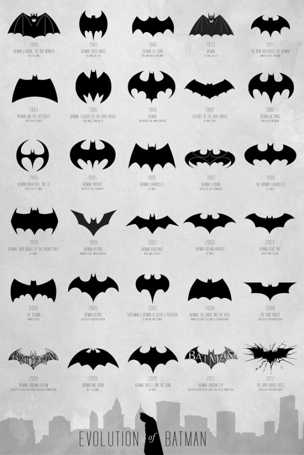
Interesting evolution of a brand. This visual covers 72 years but only three changes in the first 33 years but 27 changes since the early 70’s.

What do you think of the newest Doritos logo?
Logo for my design company. It’s a hand-drawn typeface suggestive of professionalism and down-home authenticity. http://imaginocracy.com
submitted by Bill Campbell
Cool branding experiment using the iconic graphics of famous brands switched with the
competitor’s names. Really makes you do a double take when you see it for the first time.
Submitted by Adam Garber
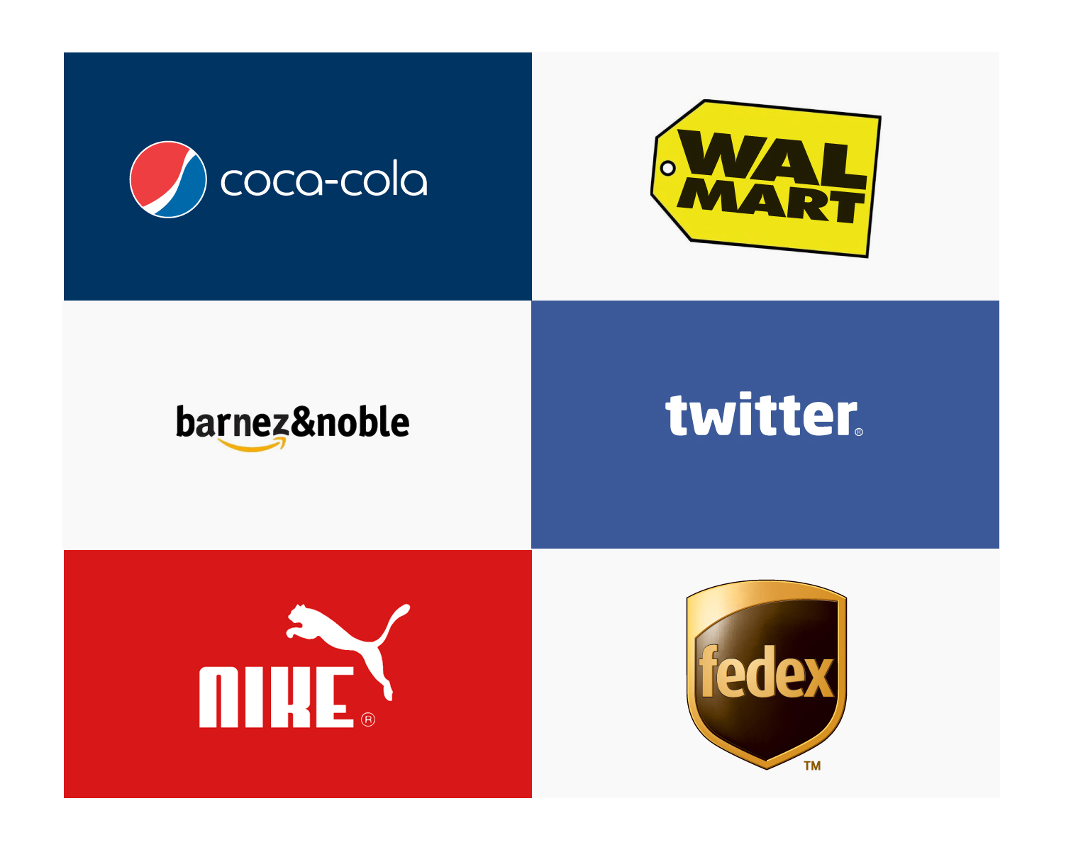
Check out even more examples at Graham’s site: http://www.imjustcreative.co.uk/brandreversioning/